by Timo Verbrugghe | Sep 6, 2017 | Conversion Optimization, Infographic, UX
Well, the short answer is no. But hold on! Before you click away, allow me to take this opportunity and explain the difference between UXprobe & analytics tools, and how their powers can be combined so you can become even more effective in optimizing your website!...

by Timo Verbrugghe | Aug 30, 2017 | Case study, Features, Journey, Management, News, UX
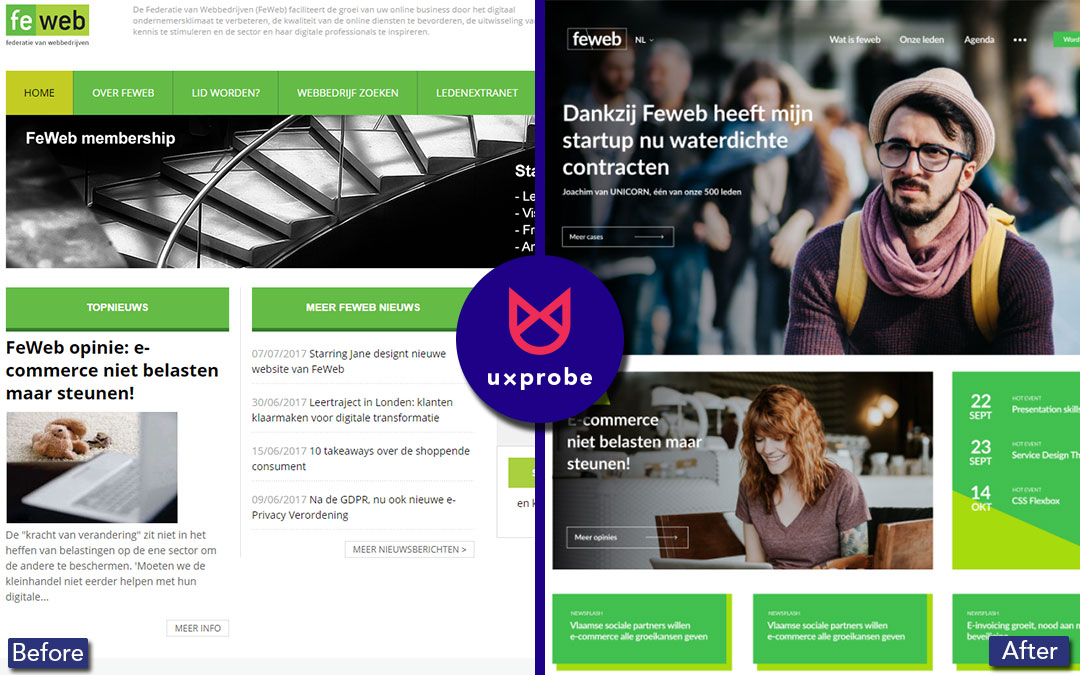
When Patrick Marck, Director at FeWeb (the Belgian Federation of Web Companies) realized their organization needed a new CRM system & website, he decided to hold a competition in May 2017 amongst FeWeb members (many of which are website design agencies) to design...

by Timo Verbrugghe | Aug 16, 2017 | Features, Good News, Journey, tech, UX
At UXprobe, we’re always working hard to bring you new features, based on your feedback, to improve the way you test. For the month of August, we’re excited to announce these new features Just ask away We’ve removed the limit of only asking one...

by Timo Verbrugghe | Jul 12, 2016 | Conversion Optimization, Opinion, tech, UX
With the start of the summer, we are getting into a vacation mood at UXprobe. Low-cost airlines are all the rage right now, so we are set on flying with them to our next tropical destination. But which one should we choose? To help us find an answer to that question,...

by Timo Verbrugghe | Jun 8, 2016 | Conversion Optimization, Opinion, UX
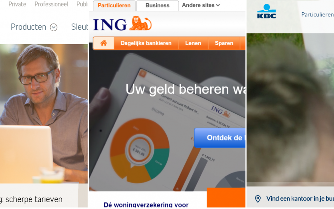
When was the last time you went to a bank branch for a transfer, or to create a new checking account? Banking websites (and their corresponding apps) are quickly gaining popularity and possess more functions than ever before. Usability, or how easy and pleasant it is...


