VAN IN has continually been working to improve the usability of their Bingel platform, an online adaptive learning platform catered to both teachers and pupils in primary education. In March 2017, VAN IN and UXprobe began performing user tests to study the behaviour of their users on the Bingel platform. The project has gone through different phases, from building up a panel of testers to analysing the results of the user tests, and making improvements to their platform based on the insights.
User testing has now become an essential tool for VAN IN in understanding their users from their perspectives, and for perfecting the user experience on their platform. Through user testing, VAN IN is now able to:
1Focus on real evidence and data instead of personal opinions to make optimal and strategic decision
2Integrate user testing seamlessly into its development process due to its ease of use and flexibility
3Make continual improvements according to the behaviour of actual users, which increased user satisfaction
UXprobe is delighted that VAN IN has benefitted so much from the outcome of the user tests. In this case study, we will explain how VAN IN has implemented user testing throughout the development of the improved Bingel platform.
“The best thing about the tool is that you can just start with it, and integrate it into the way we work” – Lieven Bossuyt, Product Owner (Bingel), Van In
Company
VAN IN is the largest educational publisher in Belgium and is part of Sanoma Learning, a division of the Finnish group Sanoma. VAN IN provides quality content and digital learning solutions that enable personalized learning and teaching, improving learning outcomes. Bingel, their adaptive and gamified platform for primary schools, was launched in 2011 and reaches 80% of students and teachers in primary schools in Flanders, completing more than 500,000 digital exercises each day. Since 2015, Bingel is also available in Wallonia, Sweden and Finland with a combined user base of more than 600,000 active teachers and students.
Lieven Bossuyt is the Bingel Product Owner at VAN IN and part of the business unit “Primary education”. Together with a team of experts, he is focused on ensuring that users are delighted with the company’s digital solutions and services. Recently, he worked together with a team of teachers and UI experts to improve the user experience on the Bingel solution for teachers.
The Project

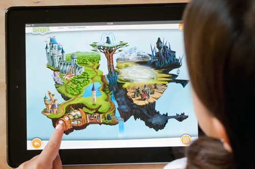
A child using the Bingel platform on an iPad
Bingel was the first online adaptive learning platform created for primary education, quickly gaining popularity when it launched. However, with the emergence of tablets, changes in technology (from Flash to HTML5) and co-creation with teachers, there were numerous add-ons to the original platform, leading to completely redesigned versions in 2014 and 2016.
UXprobe was initially not used for the wireframing and prototyping. However, with newer versions built, testing was necessary to understand the user behavior on the newly designed platform. This was important to maintain continuous improvements and to measure the user adoption of the new UI. And as Lieven shared with us, he felt that UXprobe was the best choice as “it is very easy to use, and we could immediately start testing” and also because “the cost is at a very low entrance level, which was important to us”.
The Challenges
Co-development and co-creation have always been a part of VAN IN’s values. This has been practiced for a long time with the authors of printed learning materials, where courses and learning activities were co-created and tested before being published. The goal was to set up user tests in this particular kind of environment with actual users.
There were two major challenges Lieven had to take into account when conducting such tests.
1Making sure there were enough users to participate in the tests
2See if it was possible to integrate this tool into the development cycle of VAN IN.
Thankfully, after a demo from UXprobe, Lieven and his team felt that it was “a tool that was easy to use” and saw the possibility of combining their agile development cycle with user testing for this project.
For the tasks, Lieven and his team decided to focus on the navigation and key functionalities in Bingel for teachers. They are as follows:
- Downloading teaching materials via Bingel
- Starting digital whiteboard software using Bingel
- Consulting a teaching manual in Bingel
- Assigning a digital Bingel task for pupils
- Deleting a digital Bingel task
- Personalising the Bingel settings for a class / a pupil
- (un)locking chapters for certain pupils
- (de)activating a timer for certain pupils
- Changing content to content of other grades / subjects for certain pupils
- Resetting the changed settings to the default settings for certain pupils
- Monitoring pupil’s progress via the dashboard and result screens
Our Contribution
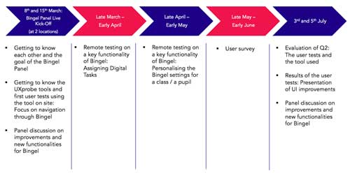
With UXprobe, the user tests were performed on the Bingel solution for teachers. Two teacher groups were created, one in Gent and one in Antwerp, calling themselves the “Bingel Panel” and containing more than 30 teachers using Bingel in various ways. In March, a live kick-off event was organized where teachers could meet each other and a first moderated user test was performed with the help of UXprobe. In April and May, remote and unmoderated tests were conducted, building on the learnings and insights from March’s kick-off. Those remote tests had a very positive outcome as none of the users requested for support when performing the tasks on their own.
The test allowed Lieven and his team to discover that the testers – a mixture of teachers who are both IT savvy and non IT savvy – were very eager to contribute both to the continuous improvement of current functionalities and to give feedback on prototypes and mockups on future learning solutions.

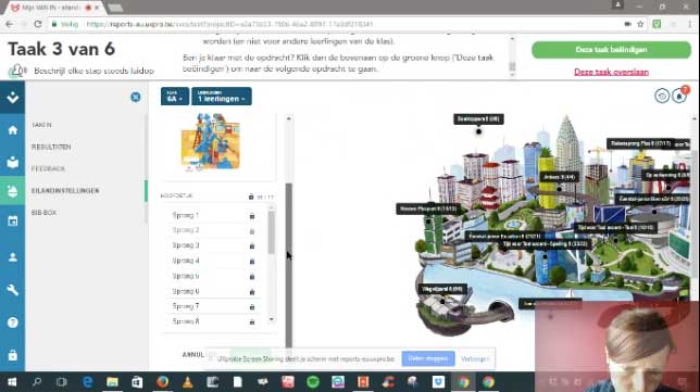
A teacher trying to perform one of the tasks set up by Van In
Furthermore, from their observations of the test results, Lieven and his team discovered that a lot of teachers calling themselves “advanced Bingel users”, still didn’t know how to use the more advanced features of the platform. Bingel started with a limited feature set in 2011, but it got more advanced and adaptive with several add-ons as more user feedback was received. The insights confirmed the team’s conviction that real life training of teachers using their platform, would help them get the most out of their students, as they have the knowledge on utilizing all the functionalities of the platform.
With UXprobe, Lieven and his team now understand that their users are more familiar with using older devices which have different kinds of pop-ups and programs installed. To their surprise, the user tests have now given them access to insights that will enable them to capture the ideal UX on their Bingel platform.
In addition, other crucial modifications were made to improve the usability of the platform. For example, after establishing that a lot of users perform a double click instead of a single one when clicking on a button, the screen to assign a digital task to the pupils was improved to prevent teachers adding and removing digital content to the task at the same time. Also, there was a reordering of the information shown on the dashboard of the platform as users felt that it was slightly overwhelming.

VAN IN discovered that when teachers added content of different subjects to a student’s task, the content was shown below the bottom of the screen, hence confusing the teacher whether the content was added or not. The second screenshot shows how they improved the screen.
The Results
Overall, the user test was a great success, and Lieven and his team are delighted with the outcome. He felt that with UXprobe, it is now easier for the business team to be on the same page with the UI-experts, functional analysts and development team and to reach a consensus on the appropriate next steps. Essentially, they can now bring the focus of the entire team on real results and not on the personal opinion of each stakeholder.
“It is necessary to have a deep understanding of the product and its users, to discuss the videos from the user tests, and push through with improvements and changes”. – Lieven Bossuyt, Product Owner (Bingel), Van In
With real life footage of user behavior, it is now more straightforward to make a decision as they provide substantial evidence of the problems and potential areas of improvements for the platform.
From this collaboration with UXprobe, both VAN IN’s business and technology teams have learned the value of involving customers in all phases of your product development lifecycle, in order to create a solution that really fits their needs and is very easy to use.
Moving forward, Lieven and his team will focus on presenting the improvements and incorporating the feedback from the participants of the user tests. This has led to a change in the development process of Van In, as they have now found a tool that is faster and completely compatible with their agile process. As such, they aim to make user testing part of their process to create a better quality UX, and by building a community of testers and ambassadors for the product who will provide feedback for continual improvements.
ABOUT THE AUTHORS

Jonathan Chua
Assistant Content Marketing at UXprobe

Jan Moons
UX expert & co-founder at UXprobe

Isabelle Dro
Digital Marketer at Muuselabs


