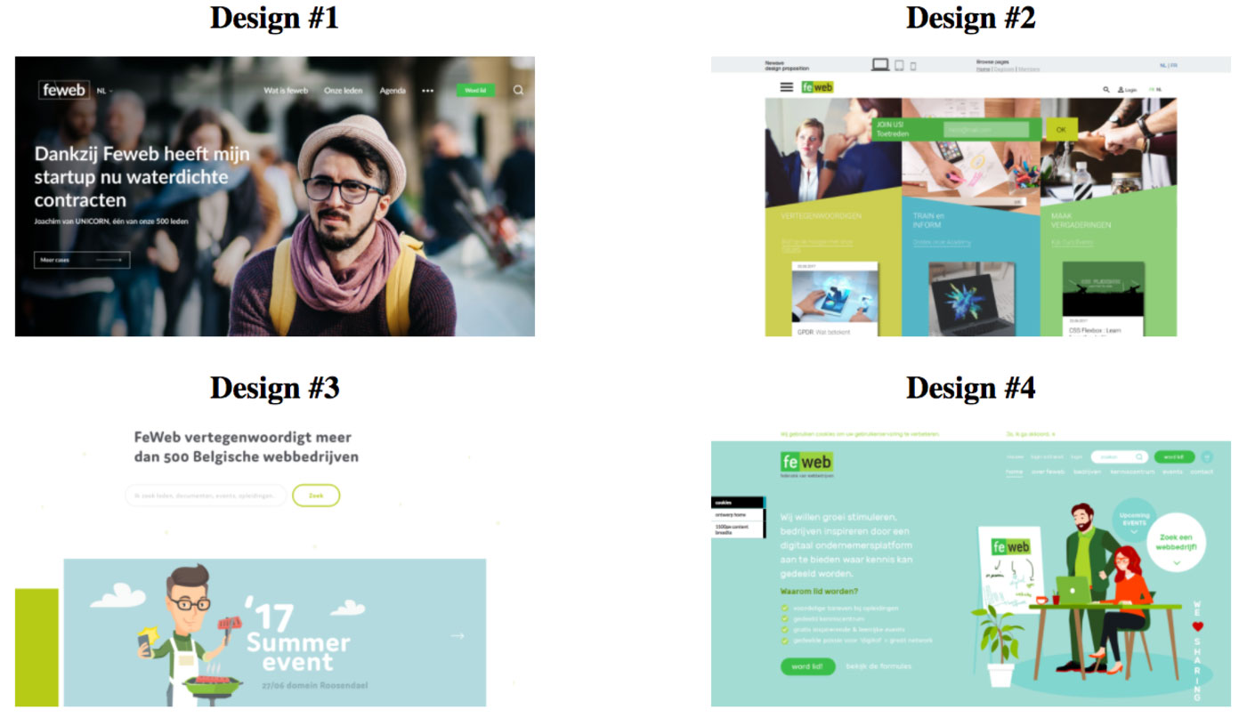
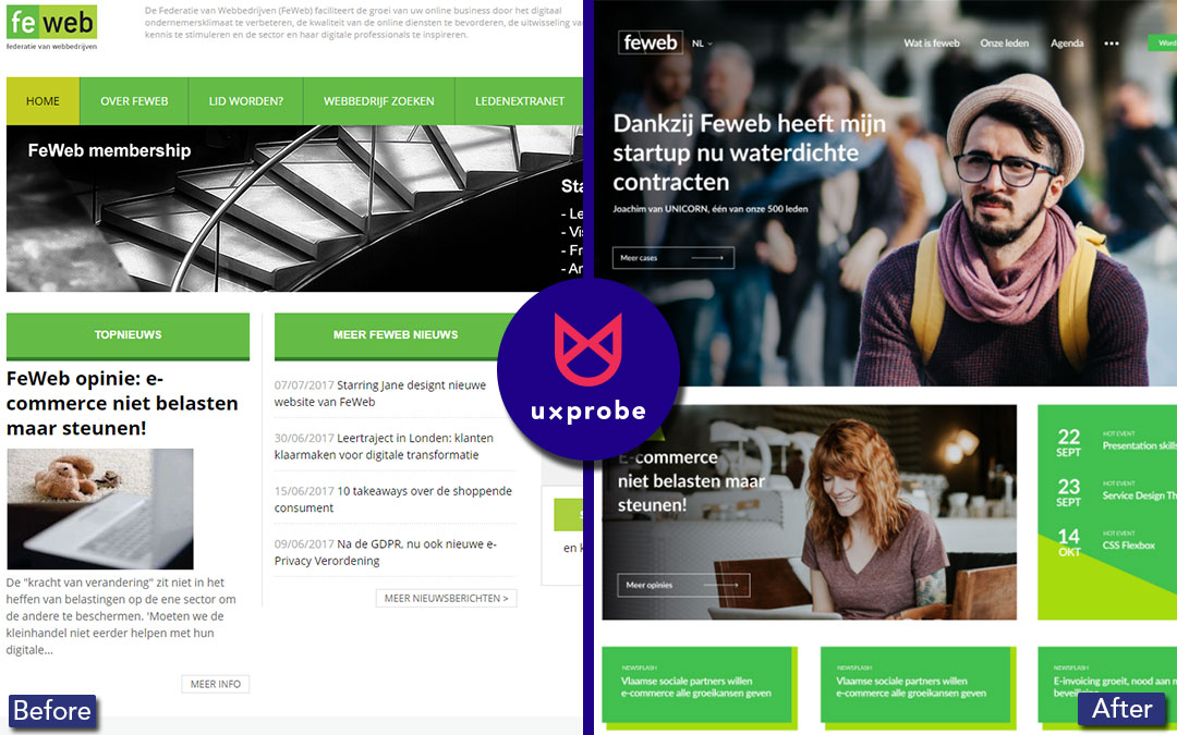
When Patrick Marck, Director at FeWeb (the Belgian Federation of Web Companies) realized their organization needed a new CRM system & website, he decided to hold a competition in May 2017 amongst FeWeb members (many of which are website design agencies) to design the best website according to FeWeb’s branding guidelines.
Patrick wanted the choice of FeWeb’s board of directors to be well-founded by letting people with a background in digital marketing & user experience design, do an assessment of the submitted designs.
Thanks to UXprobe, Patrick was able to:
Quickly set up a test in which the jury could review all of the designs, record their feedback and pick out their favourite
Send out a URL to 15 jury members, allowing them to do their review wherever and whenever they wanted
Analyze the results using the built-in survey tool to see which design was the most popular among jury members
Listen to jury feedback on every design separately, recorded using their webcam and microphone
Present his analysis to the FeWeb board of directors, who agreed with the jury’s decision after reviewing their feedback.
But that’s not all: since the feedback that Patrick got was extremely valuable to all candidates of the design competition, he shared it with the companies who joined FeWeb’s website design competition. Also, since no design is perfect from the start, Starring Jane & FeWeb will be able to use the data they gathered from this test to improve the design before they launch the new website this fall.
The FeWeb Design Competition
Since a large part of their members’ main activities are designing websites (with several Board of Director members part of website design agencies such as Wijs, Starring Jane and Intracto), FeWeb needed to open up the process of selecting the company as much as possible.
After Jan Moons, our UX expert, gave FeWeb members a three day UX course in October last year, Patrick saw our tool’s potential for quickly gathering feedback of new designs for their website.
The organization’s website at the time was starting to show its age. It was launched almost 15 years ago, with a few tweaks and small design changes over the years, mostly to the home page. In the meantime, FeWeb had already chosen a new CRM & CMS system, Procurios, which quickly developed the need to have a new website that would be compatible with this new platform.
Patrick then set out to assemble a jury of 15 people, with these two goals in mind:
1The jury as a whole needed to be non-partisan towards possible candidates, in order for FeWeb to show to their members that nobody got any privileges
2Patrick wanted feedback to come from several points of view, since judging designs can be subjective based on your background.
Because of these requirements, the jury consisted of people with a background in website design, marketing, user experience and data mining.
The Challenges
FeWeb had already conducted user surveys on their old website to gather feedback. This, together with traditional web analytics tools, already gave inspiration for some redesign ideas. The challenge was making sure that these insights would not distort both the jury’s and the participant’s mindset, since FeWeb did not want to influence possible ideas or feedback. They only wanted to insert their own point of view at the Board of Directors meeting, after jury feedback had been assembled.
FeWeb did send out a briefing to participants with contest rules and general statistics, but left the designs open to their imagination.
After the winner had been chosen, there would still be time to tweak the design based on statistical data and jury feedback. This competition was a starting point, not a final design. This is why FeWeb needed to ask open-ended questions to the jury in an environment where they would be comfortable to review the design fully, based on their experience or expertise.
Our Contribution
1. Jury Duty, done in three days
After candidates handed in their designs at the end of May, Patrick still needed to send out all of the designs to the jury. Since they were spread all over Belgium, he opted to generate an url in UXprobe that allowed the jury to do their review anywhere they wanted to. Together with a coordinated deadline, Patrick was able to gather all reviews in only 3 days. He could also quickly see which jury members still had to send in their review.

At the end of the test, jury members were presented with all 4 designs in order to make their final choice
2. Four different websites, only one test needed
Ease of use was important for FeWeb, both on the tester side and after the test, when doing analysis. The fact that all 4 designs were hosted on different servers (of each design agency) wasn’t a problem for UXprobe. Patrick could start each task separately on a different URL, which made the review go smoothly for the jury members switching from one design to the next and allowed Patrick to quickly compare feedback for each design.
3. Feedback, both spoken and written
Patrick quickly noticed that the Jury had different ways of providing feedback, saying “I quickly saw 2 types of jury members: on the one hand, you had the person that said nothing, but wrote everything down in the open question survey and the multiple choice question to pick the best design at the end of the test. On the other hand, certain people started giving their opinion the moment they saw the design, such as ‘This design is way too busy’ or ‘A lot of call to actions on this page’.”
Patrick was also interested in feedback from people with the same background. “I recall one instance where 2 design experts were divided over the use of our main brand colour, green. One person saying that the use of green strengthened the design, the other saying that it overwhelmed him. Eventually, since we had a large tester base, we were able to take both their feedback and other ones about the use of colour into account, when making our final decision.”
“Being able to gather the feedback and deliver it at the end of the competition to all participants was also greatly appreciated. We were able to give back an assessment on navigation, use of colour and usability in general, both positive and negative remarks. That way, everybody gained something out of the competition.”
Final results
The decisive reason why Starring Jane was declared the winner of this design competition, was because they captured the startup mentality in their design.
The tests confirmed certain elements that Patrick already found positive or negative about a participant’s design. “I’ve had multiple occasions where I created an opinion on a certain design, but a certain jury member gave me the terminology I needed to phrase my view in a better way to our Board of Directors.”
But because open-ended questions were asked and the jury could speak freely, other findings could also be included in Patrick’s analysis, that would otherwise have gone unnoticed.
By using UXprobe in their design competition, Patrick saved FeWeb a significant amount of time and money by:
Allowing the reviews to be done in a more flexible way, by letting jury members choose when and where they gave their assessment
Enlarging the base of possible jury testers, making sure that feedback was justified and coming from people with a different background
Gathering data using UXprobe’s built-in survey tool, giving Patrick an easy way to see which design was preferred amongst jury members
ABOUT FeWeb
FeWeb, founded in 2003, is the Belgian Federation of Web Companies, recognized by the Belgian minister of Economics. Its goal is to facilitate growth in the Belgian web sector by enhancing the business environment & the quality of online services, stimulating the exchange of knowledge among its members and promoting the sector as a whole. Today, FeWeb has around 520 member companies.
Patrick Marck is Director at Feweb since March 2014. As Director, Patrick’s goal is to improve the services offered by the organization. In this project, Patrick was responsible for the organization of the design competition and the analysis afterward.
The FeWeb board of directors consists of 12 members with Peter Ryckaert as its president.
To view the announcement of the winner or learn more about FeWeb, click here.
ABOUT Starring Jane
Starring Jane, a digital/online marketing agency that was founded in 1993 and is now situated in Gent, is a full-service digital partner which focuses on co-creation with its customers in order to ensure a process of continuous optimisation, inspired by the idea of design thinking.
Services offered by Starring Jane include: digital strategy & concept, online projects in a CMS or framework, web application design & implementation, webshop & website design, content marketing and conversation and infrastructure support.
Starring Jane has already worked with numerous partners including Mercedes-Benz, konvert, Partena, VOKA and the Flemish government.
To learn more about the winner of the website design competition, check out the website of Starring Jane.
ABOUT THE AUTHOR

Jan Moons
UX expert & co-founder at UXprobe


