UXprobe’s technology has conventionally been used to perform user tests and gather valuable data to improve the usability of websites, applications and chatbots. However in June, we were inspired to conduct a little experiment for the pre-release of our VRT case study white paper. The idea was simple: it was to get real users to “test” our case study using the UXprobe platform.

|

|
|

|

|
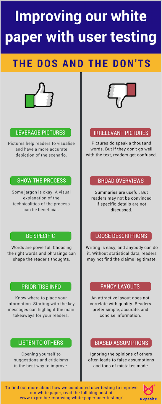
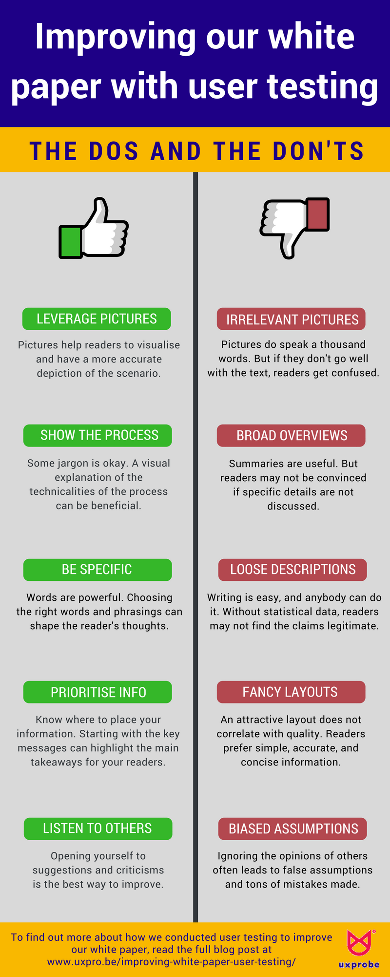
We also made an infographic which summarizes our learning points into the “Dos and Dont’s” of writing a white paper. Click on the preview on the right to check it out!
About the experiment
We sent out the test links to a panel of users to review our case study. They were tasked to read through the entire case study, and to talk out loud when they wanted to provide feedback on a specific section, illustration, content, etc. At the end of the test, they had to answer 4 questions which would subsequently help us in our analysis:
- How likely is it that you would send it to a friend or a colleague?
- Can you tell us in a couple of words what the use case was about?
- Is there something missing that you were expecting?
- Do you agree or disagree that the illustrations were useful?

Users on the UXprobe platform reviewing the VRT case study white paper and answering the questions at the end of the review.
Responses to the questions
In total, we had 6 reviewers who participated in this test. From the test results, 5 of the reviewers stated that they would likely share the case study with their friends or colleagues (Question 1). Also, 4 of the reviewers agreed that the illustrations were generally useful (Question 2).
When asked to write a summary of the case study, users were able to provide a brief yet accurate description (Question 3). Most of them mentioned the “redesign of the deredactie.be website”, “using UXprobe to convince management and stakeholders”, and “to gather data and insights, and important information”.
Reviewers were also asked if the case study lacked something, for which we received some valuable suggestions (Question 4). Such as…
- “A timeline overview of the whole testing process”
- “An executive summary at the beginning, and a few arguments on why this case was a success”
- “Numbers will be nice to have, to show the results of making the UI changes”
The responses were certainly affirming and provided us with great insights. However we were curious about the varying responses, and so we decided to further investigate by analyzing the video sessions.
Investigating the video sessions
After watching all the videos and analysing the audio, there was a total of 37 comments, of which 27 (73%) are categorized as “Points for improvements” and 10 (27%) are categorized as “Positive comments” (Figure 1).
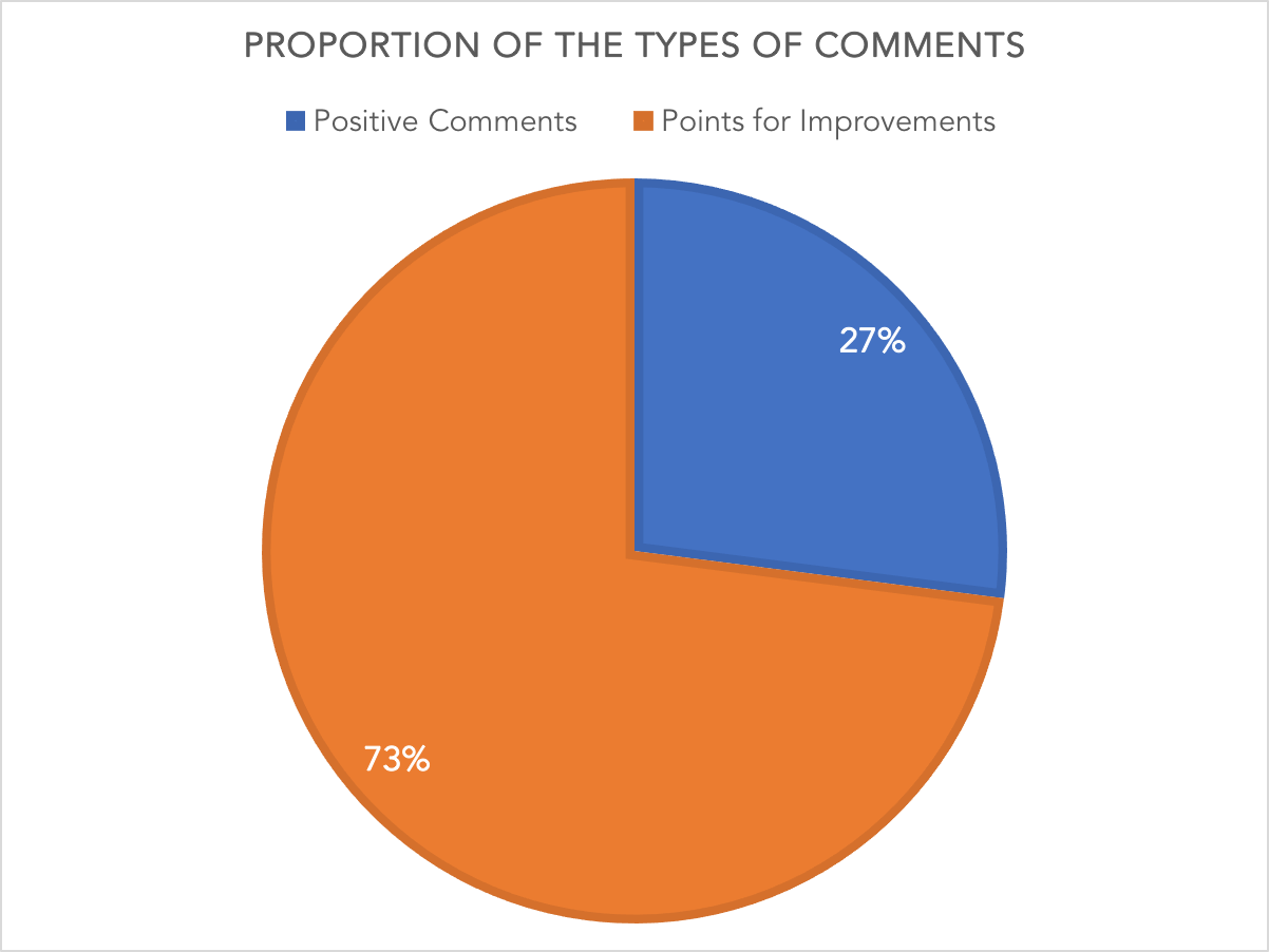
Figure 1

Users spoke aloud throughout the recording to provide feedback and opinions as they reviewed the VRT case study white paper.
Points for improvements
With the 27 “Points for improvements”, we were able to classify them into 4 specific categories:
- Content
- Illustrations
- Layout
- Words
In the bar chart below, it shows the 4 categories and its proportion to the total number of “Points for improvements” (Figure 2).
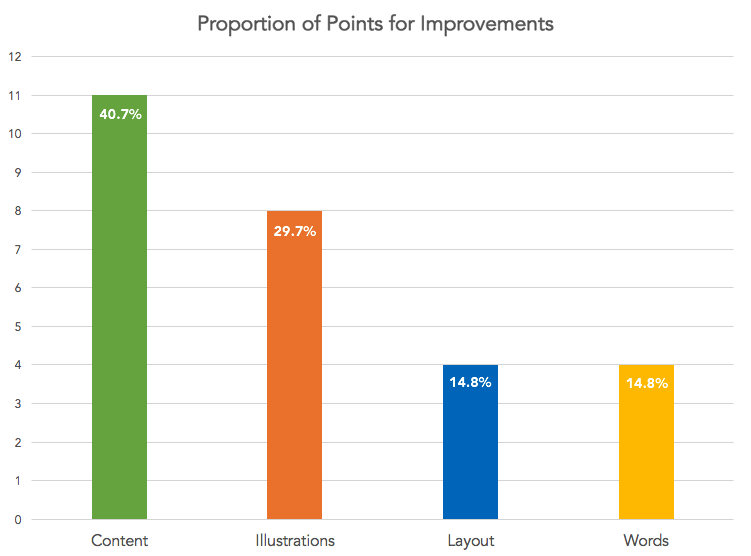
Figure 2
With this categorization, we were able to identify each comment and relate it to a specific aspect of the case study which required improvements. Let’s see what our reviewers said about our case study…
-
Content: Should we dive into the details?
Interestingly, our content received the highest number of comments. We were intrigued by what our reviewers had to say for us to make improvements. We had a focus on the challenges faced by VRT and how UXprobe contributed to solving these issues. However, we realized that our readers were also interested to know the specifications and in-depth details of the project.
For example, the reviewers were interested in the tasks and questions used and how the setup of the test was done. A suggestion from one of our reviewers was to include a timeline explaining the process of the test, starting from the definition of tasks, to the setup of the scenario and lastly the implementation of the UXprobe tool. From this, we learned that a visual explanation of the procedure of the project will be useful to help our readers get a definitive understanding of how user testing with UXprobe works.
-
Illustrations: Do our pictures improve clarity?
Multiple illustrations were used in the case study, such as screenshots of the users testing the VRT beta website and pages of the deredactie.be website. However, many of our reviewers felt that the illustrations could have been better used. What did this actually mean? Our reviewers shared with us that the images “could have been better linked to the text”, and that “the images did not explain a lot more or really go together with the text”.
What we found out here was how important the arrangement of the illustrations fit together with the text in the case study. They both have to flow smoothly together, as what one of our reviewers said, “the layout was more focused on the text rather than the illustrations”. What we learned is that the use of both illustrations and text was essential in building the right story and facilitating the reader’s understanding.
-
Layout: Is going simple or fancy the better way?
With regards to the layout of the case study, most of our reviewers were satisfied with it. However, one of them suggested that the beginning should be more captivating and alluring for readers. As mentioned, “A quote should be used up front, and an explanation right at the beginning to share about the advantages VRT gained from using UXprobe”.
Also, he brought up a point that “people do not read until the end, and it will be good to convey your main message at the beginning”. From this, we learnt to prioritise our information so readers can understand the main takeaways from the case study, especially if they will only be browsing through it.
-
Words: Do our descriptors convey the right message?
Overall, there was not much feedback on the choice of words used, but there were a few specific suggestions made. One reviewer mentioned that he was confused over the summary points in the “Results” section as he felt that two of the points were hard to differentiate. Moreover, another reviewer suggested that the word “struggling” seemed slightly pessimistic in the quote header, and instead, positive words should have been used to convey a more optimistic message. Lastly, a reviewer perceived “minimal time and results are obtained in a matter of days” as “sales driven”. With these, we are now more aware of the words we should and should not use after observing how minor yet impactful it can be for readers.
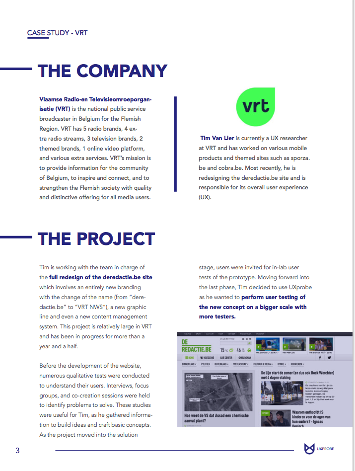
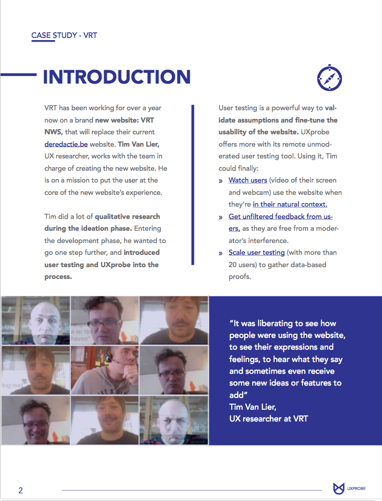
Before
After
In our latest version, we removed the company and project description. Instead, we started with the introduction that provides a brief overview and key outcomes from the project.
Positive comments
We also received positive comments which were useful in helping us retain what was good for the readers in the case study. Again, we were able to classify the 10 comments into the same 4 categories, and its respective proportions are as shown in the bar chart below (Figure 3):
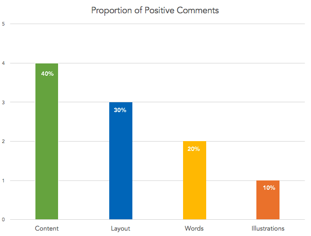
Figure 3
-
Content: Making it simple yet insightful for readers
For the content, some of the reviewers expressed their satisfaction and said they would certainly share it with their colleagues. They mentioned that “overall it was a very good way to show the use of UXprobe in a real life project setting”, and some shared that they “believe in the value of what UXprobe does”. Moreover, reviewers also felt that there was a good overview of the successful outcomes of the project at the end of the case study. One reviewer also shared that the content was easy to read as she could “understand what the project is about”.
-
Layout: Being concise and prioritising important points
With regards to the layout, reviewers felt the quotes used and bullet point lists in the case study assisted them in understanding the key takeaways. Furthermore, another reviewer felt that information in the case study was of “a right length and bolding of words were helpful”. This affirmed our assumption that readers prefer to receive concise information, and such layouts of information are appealing to them.
-
Words: Engaging the readers and their emotions
A reviewer was delighted to read the “Challenges” section as she felt that it was written like a story, and another reviewer mentioned that he could feel “empathy” for the client as he read the same section. This kept them reading on to the next section, which is highly important to retain their interest in the case study. This feedback was highly useful for us to identify the optimal way to craft our writing and choice of words.
-
Illustrations: Creating a story with visuals
One of the reviewers felt that the illustrations were interesting to see, especially when the “user performing the tasks is making an exasperated face or showing an emotional feedback”.
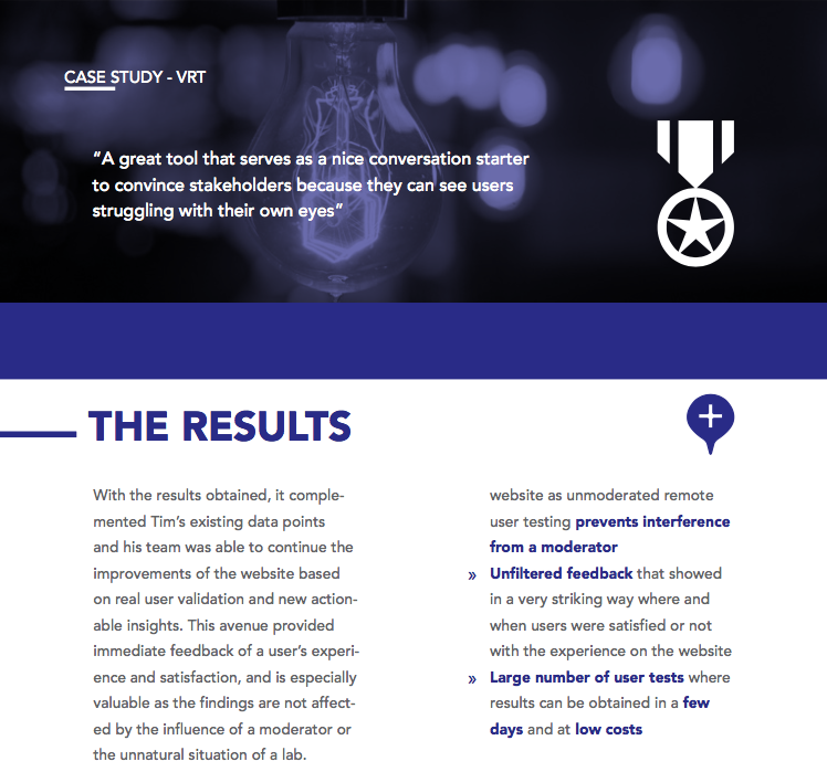
In the results section, bullet points were used to summarize the takeaways from the project. A quote was also used, showing the client’s response to using our tool.
Our key takeaways
With everything that we have learnt from the feedback of our reviewers, we decided to create an infographic of the key learning points from this experiment. We hope with this, it will help you to make improvements or serve as a reminder to avoiding making mistakes when writing the white paper.
Want to see the final and improved version of the VRT case study white paper?
ABOUT THE AUTHOR

Jonathan Chua
Assistant Content Marketing at UXprobe


