At UXprobe, we’re always working hard to improve the way you perform your usability tests, based on your feedback of our product. This is why we try to add new features regularly to make it easier for you to perform tests with larger audiences, review tests faster & get your test results quicker.
In the past few months, we’ve added new features such as task randomization, enhanced the way you navigate your videos and added new languages. Let’s go over these in more detail:
Task Randomization

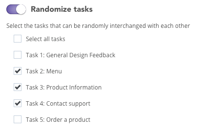
In this example, tasks 2, 3 & 4 will be randomized. Task 1 & 5 will be shown as the first and fifth task respectively.
Based on customer feedback, we’ve added the ability to randomize tasks in your test. If you don’t want the order of your questions to influence feedback, this feature is exactly what you’re looking for!
On top of randomizing all tasks, we also give you the option to only randomize certain tasks. For example, if your first task is meant to introduce someone to a project or website (to give general feedback about the design for example) and you need this task to be shown first, then UXprobe has got you covered!
You can find this option on the Tasks tab of the Project Info page. Once you enable the option, you have the option to randomize all tasks or select the tasks you want to be shown in a random order.
Adding a splash of color

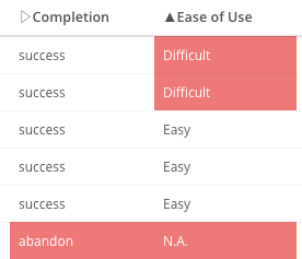
You can now easily see which sessions either failed, were abandoned or were answered unfavorably by your testers in a session list
You got a big amount of recordings and now you’re ready to start reviewing them? But where do you start? Well, we have now added some colors to the sessions tab on the Tasks page in UXprobe.
You can easily see if someone completed his or her task successfully (based on a verification question that you can set up) and/or if the tester answered the standard ease of use multiple choice question (“Overall, how easy or difficult was it to perform the test?”) with Very difficult, difficult or neither. Also, sessions that were incomplete, abandoned or failed will now be marked in red.
We also added this functionality when you go to the general Sessions page that you can find on the left side menu. There, we mark in red which tasks your tester has failed on during the entire test.
This functionality will make it easier for you to find out which sessions to check out first!
Easily go to a specific part of a session
This is a big time saver for our customers: you’re looking through the answers of our built-in survey tool and see something interesting that one of your testers wrote. Wouldn’t it be great if you could immediately go to the part of the session where he fills in that answer?
Well, that will now happen automatically when clicking on that answer in the list! This feature is available throughout UXprobe: looking at the session list in a specific task or clicking on a specific annotation you made? We’ll send you to the relevant part in the session.
Just want to start from the beginning? You can always use the player controls to revert back to the start or select a session from the Sessions page.

Clicking on a survey response will now immediately jump you to the point in the video where the tester answers that question!

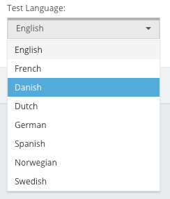
UXprobe now supports up to 8 different languages for testing!
Swedish, Danish & Norwegian testing language support
Hej! Hallå! Hei!
We have added more languages to UXprobe, so people in the Nordic countries can now perform tests in their native language! Just select the language you want when starting a new project.
Note that this will only change the UXprobe UI for testers (such as the language of our buttons or our titles), but that you still need to provide the task instructions yourself.
Other behind-the-scenes updates
Smaller updates were also added to improve your UXprobe experience.
- Our customers noticed synchronization issues in specific cases between the webcam and screen recording videos. These have now been resolved by our engineering team!
- We switched our video encoding to a more efficient algorithm, which results in a faster video player (loading, switching to a different part in the video, etc…), alongside other improvements to the review experience.
- We reviewed our systems and added extra security features in other to be compliant to the new European GDPR standard. More information can be found in our Terms of Use.

